No single topic seems to arouse as much blog animosity as any discussion of Hansen’s projections. Although NASA employees are not permitted to do private work for their bosses off-hours (a currying favor prohibition, I suppose) – for example, secretaries are not supposed to do typing, over at realclimate, Gavin Schmidt, in his “private time”, which flexibly includes 9 to 5, has provided bulldog services on behalf of his boss, James Hansen, on a number of occasions.
In January 2008, I discussed here and here how Hansen’s projections compared against the most recent RSS and MSU data, noting a downtick which resulted in a spread not merely between observations and Scenario A, but between observations and Scenario B, sometimes said to have been vindicated. For my January 16, 2008 post, I used the then most recent RSS data (as well as UAH version which showed a lesser downtick. However, a few days later, RSS revised their data to be more in line with UAH. On January 23, 2008, I updated my graphic, using the revised RSS data, which caused a slight modification. Some blog commentators have suggested that I had made in error in my Jan 16, 2008, but these suggestions have no purpose other than defamation. I had used the then current data and promptly updated my graphic within a few days of RSS revising their data. In the latter post, I criticized RSS for not issuing a notice of the change.
In a post today, Andrew Bolt used the earlier version of this graphic from January 16, 2008, rather than the January 23, 2008. A couple of blog commenters have criticized Bolt for using the earlier graphic, with Tim Lambert additionally criticizing me for not having placed a notice of the update on the Jan 16, 2008 post (which I’ve now done.)
However, rather than engaging in further exegesis of the January versions, I thought it would be useful to update the graphics to include satellite data up to June 2008 and GISS data up to May 2008. Ironically, the new data has resulted in a downtick that is more substantial than either of the versions published in January. Lucia has also done many posts on this topic and I urge readers to visit her blog.
I’m going to post up a few different versions in order to forestall pettifogging about provenance as much as possible. On the top left is May 2007 graphic comparing observed versus actual from Hansen bulldog Gavin Schmidt (which I also showed in my Jan 16, 2008 post). On the top right is Hansen projections (realclimate version plotted against monthly GISS GLB to May 2008), both in native units (1951-1980 for GISS GLB; Hansen forecasts seem to have a similar centering). On the bottom left is the same for GISS land only and on the bottom right the same for RSS satellite. RSS satellite is a bit lower than GISS, but the effect is the same.) I’ve re-centered RSS to match GISS GLB on 1979-1997.
 |
 Color code in legend needs to be fixed. |

|
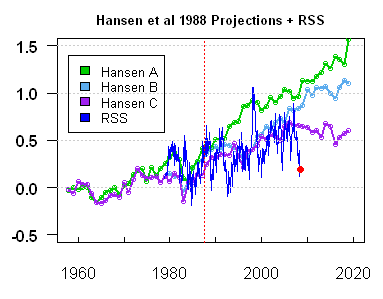 |
Figure 1. Hansen 1988 projections versus observed – see text for description.
The next set of graphics compares the present RSS version (illustrated above) to the two versions presented in January 2008, with the RSS version re-color coded to match the January coloring. On the top right is the January 16 version using the original RSS version (then current). On the bottom left is the revised Jan 18, 2008 RSS version. I’ve plotted the current information in a monthly format in order to bring matters up to date and tried to de-spaghetti the graph by simply plotting extra versions. I’ve plotted these versions ending in 2010 (the upper panel ends in 2020) because the January graphs ended in 2010. Given the events of the months following January 2008, Bolt’s use of the January 16 version, as opposed to the January 23 version, has not resulted in any over-statement of the downtick. On the contrary, the downtick has been greater than observed at the time.
 LEgend color code needs to be amended. |

|

|
Figure 2. Hansen projections against satellite observations. Top left – current; top right – Jan 16; bottom left – Jan 23. The centering in the January versions is a little different (the effect is not material). Hansen’s projections do not center on 1951-1980 and it’s hard to tell what the actual centering was. Any attempt to re-center Hansen projections to a common reference period with observations seems to cause shrieking, so I’ve used native units, as the re-centering effect to 1951-1980 is not large in any event. I’ve re-centered the satellite data so that its mean in 1979-1997 matches the GISS GLB mean.
In my opinion, there is enough autocorrelation in these series such that, statistically, the uncertainties in the trend are much wider than sometimes thought and are sufficiently wide that neither Hansen’s Scenario B (nor scenarios with lesser and greater “true” increases) can be said to be rejected – contrary to the views of many readers. However, that’s a different story. I am also not commenting – either to approve or disapprove of other aspects of Bolt’s posts. My concern here was simply to reconcile results that I’d presented.
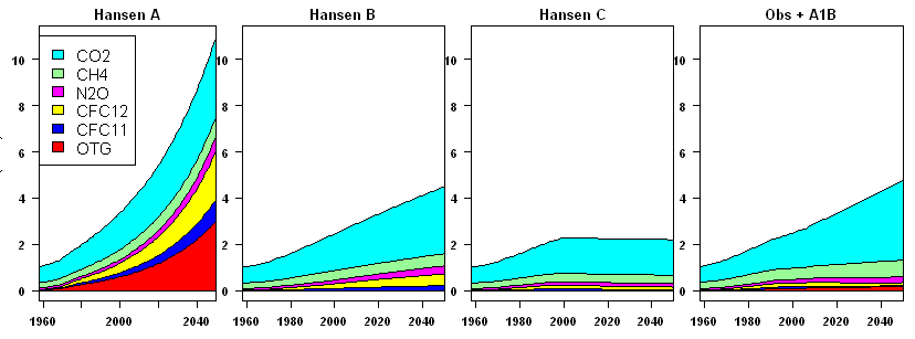
Update Note: People have inquired about actual forcing in these terms. I spent quite a bit of time earlier this year trying to decode Hansen forcing estimates by GHG type (which is important) versus observed resulting in the following graphic – on the right is observed plus present A1B forecast. In terms of forcing projections, B is the closest scenario. As noted in my earlier post, Hansen provided opinions on several different occasions, but my sense of his own forecast is this statement of his: “My guess is that the world is now probably following a course that will take it somewhere between A and B. (p. 51)” – see prior post for reference. One has to distinguish skill as a GHG emissions forecaster from model evaluation – a distinction that Hansen fairly makes. I think that Scenario B is close enough to observed emissions that, in the absence of NASA being able or willing to re-run the actual 1988 model with actual forcings, one can be reasonably use Scenario B for comparisons.